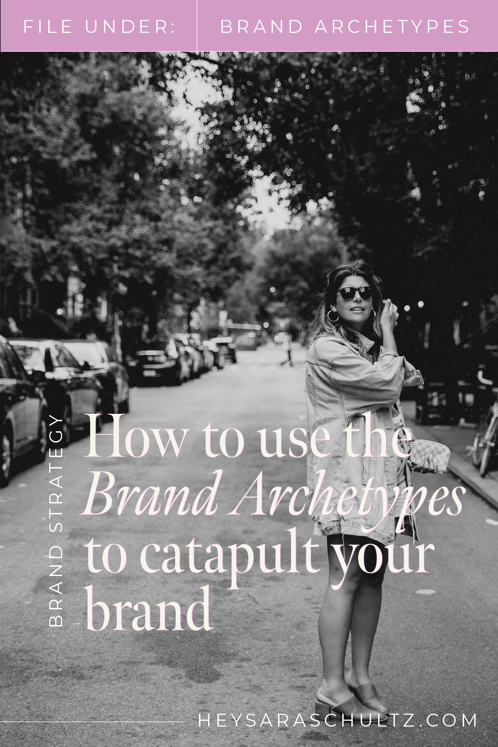
Want an Instagram glow-up? Follow this cardinal rule
I'll let you in on a little secret:
One of the key methods for creating a stunning Instagram grid is nailing a little something called composition.
Here's what I mean by composition: the arrangement of elements within a frame that results in a visually-appealing, meaningful aesthetic. But here's the thing, in order for it to work, your composition needs to be deliberate.
That means the composition of your individual photos needs to be just as deliberate as the composition of your overall grid.
And here's why this is oh-so-important: dreamy compositions deliver a memorable brand story, and memorable branding is what earns you follows and, more importantly, wins you dreamy clients.
So, how do we nail composition when it comes to our social media feeds? And what elements should we be paying attention to? Ask and you shall receive, my friend!
Deliberate composition is key to an Instagram glow-up
There are two important parts to consider when it comes to composition on your social feeds:
The composition of the individual pieces of content you're making
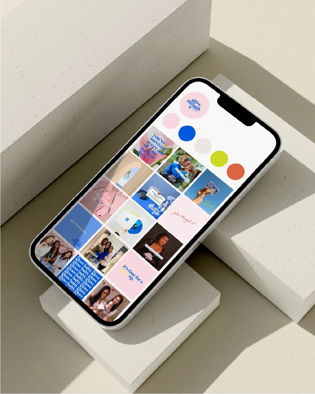
Your overall grid composition
To create something brand-f'in-tastic, you'll have to play around with a variety of composition styles. When you do this, your overall grid composition will tell a story and convey a particular aesthetic, while each individual asset has the job of supporting the overall narrative through different types of engaging content (this keeps people interested in scrolling through your feed).

Image styles you can use to create an engaging narrative
There are soooo many ways you can play when it comes to content. The thing to remember here is that finding your perfect mix will help hold your dreamy client's attention and also naturally create a road map for content planning.
Here's a list of image styles that can plug into one another to create a seamless overall composition:
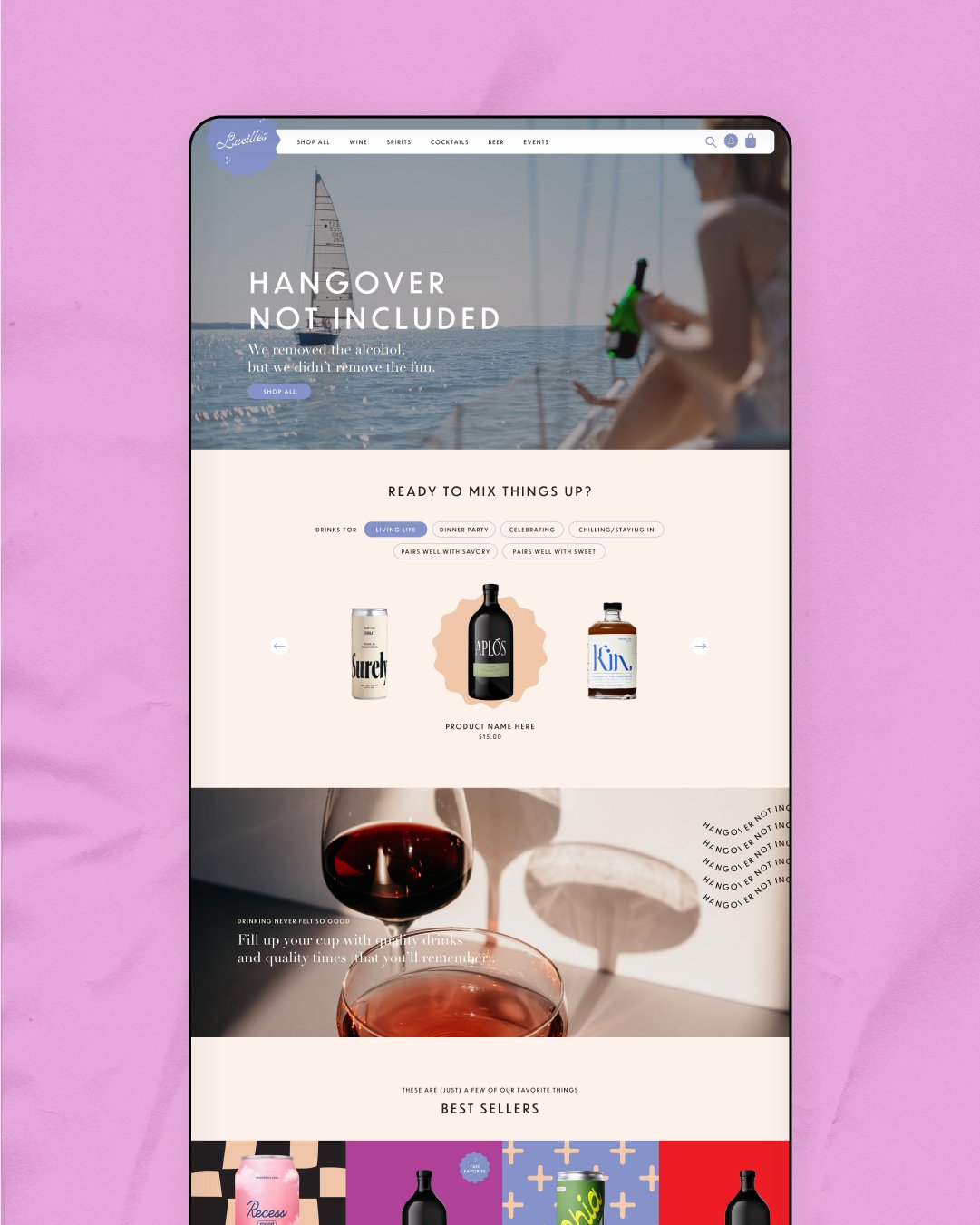
Flat Lays: These are top-down shots of thoughtfully-arranged items captured from above. Let's say you're an illustrator who wants to feature your stationery designs: Maybe you organize a sampling of invitations and greeting cards across your desk, capturing the portfolio work alongside your pretty markers, a steaming cup of coffee, and your watercolor set. It's a much more engaging way to show off portfolio work that creates a lifestyle vibe and gives your clients a peek behind the scenes.
Portraits: You can think of this in terms of orientation -- a vertical image that's taller than it is wide -- as well as literal portrait photography. This is a favored orientation on channels like Instagram and Pinterest, so it definitely plays to a good feed. It's also an awesome way to bring humans into your story, which warms things up and adds authenticity to your overall composition.
Close ups: These zoomed in, tight shots are a great way to capture the important details. Let's say you're a wedding florist who wants to capture the magic of a few blooms draped across the altar. Using a close-up shot invites your clients into an intimate moment that tells the story of your attention to detail. Absolutely use close-up shots where it makes sense to focus on details that support your overall brand narrative.
Landscapes: Unlike portrait orientation, landscape is a horizontal image that's wider than it is tall. This style is a great way to capture big moments and larger concepts. Maybe you're an interior designer who wants to show off some beautiful before-and-after projects. Use all the space you can get to demonstrate the dramatic transformation and highlight your abilities.
Selfies: Ahhh, the selfie. A word that we probably wouldn't have if it weren't for social media! Now, I'm personally a fan of the selfie, but also believe there's a time and a place for it. For some of you, sharing a self-taken photo might not make sense for your brand strategy. For others, it may be a huge opportunity to connect through a more casual form of photography. Decide what's true for the story you want to tell with your brand before you start down the execution path.
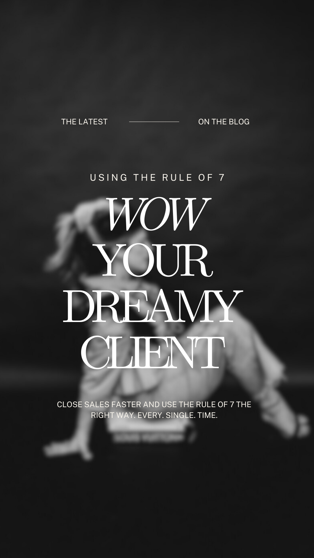
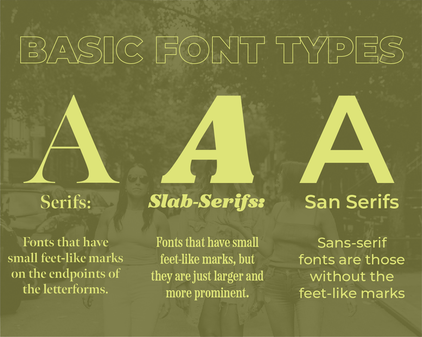
Digital graphics: Assets created via a design program are an incredible way to drive brand recognition. Sprinkling graphics into your feed gives you the chance to show off your fonts, color palette, elements, and other beautiful touchpoints that further your narrative and make it pretty damn clear that it's YOUR feed. From something as simple as layering a font over an image, to something as involved as creating a how-to or infographic, graphics are an essential part of any feed composition.
Thoughtful composition helps keep your content interesting
Whew, that was a lot. But I promise you that nailing your composition is going to help you build a grid that flows better, creates consistency, tells a strong story, makes a good first impression, and delivers the branded experience that will speak to your dreamy clients.
Damn, that sounds good, doesn't it?
I hear you nodding "yes," so here's what's next:
First, do an audit of your current feed. What's working? What's not? Which image styles do you think would give your feed composition a glow up? Take stock so you can make adjustments.
Then, think about the composition you want to achieve and start planning your content around it. Decide what makes sense based on your brand strategy, budget, and posting cadence. This will help pave the way for your content creation process (no more planning individual posts in a silo!).
If all of this sounds great and you're feeling ready for more…
Think about taking my $24 course, The Good Feed. Composition is just one of the chapters I break down to help you build a better feed, because creating a branded grid doesn't have to feel painful. You can learn more about it here and self-pace your way to a social feed you feel proud of. I'll be here cheering you on the whole time! (No really, I will. If you get stuck, you can literally send me an email and I will answer it!)

Read more: