How to Build a Better Website Part 2: Design Strategy
Welcome to the second part of my series about building a better website!
Welcome to the second part of my series about building a better website!
Hopefully you already dove into Part 1 where I explored the foundational elements you need to incorporate to help your website grab your dreamy client's attention. With that in mind, let's move on to today's topic: Design strategy.
We'll get in the weeds on what you should consider when you start designing your website so that it's not only visually appealing but also functional, user-friendly, and aligned with your business objectives. Getting this part right ensures that your website has the power to engage and convert, which is really what all of us are after.
Start your design strategy with the beating heart of your website: The homepage
Your website is the face of your brand, and the homepage is typically what delivers a first impression. You need this interaction to be strong, memorable, and scroll-inducing. That's why it's super important to have a thoughtful hierarchy, flow, and design on this page.
Personally, I like to think of the homepage as a charcuterie board: it contains a sampling of all the most important, relevant, and delicious information people will need to ingest to help make a decision or take action. And we all know that thoughtfully-designed charcuterie boards are way more appetizing than the ones that look like lunchables.
But it's not just about looking pretty -- it's also about taking a strategic approach to how you dole out the information.
Translate Your Main Nav to Your Homepage Flow
One of the most straightforward ways to establish the hierarchy for your homepage is to take inspiration from your main navigation. In theory, that's where you've already mapped out the most important sections of your website -- the ones you want people to find as directly as possible. (If you're not nodding "yes" at this moment, take a pause and sketch out those components right now.)
With those inputs in hand, translate your nav into a top-to-bottom homepage experience. This will allow you to introduce the most important elements of your website at a high level while pairing that information with CTAs to encourage clicks.
For some people, the information on your homepage will be enough to get them to convert. For others, they'll need to explore further, clicking on the CTAs to visit individual site pages where longer-form information is captured.
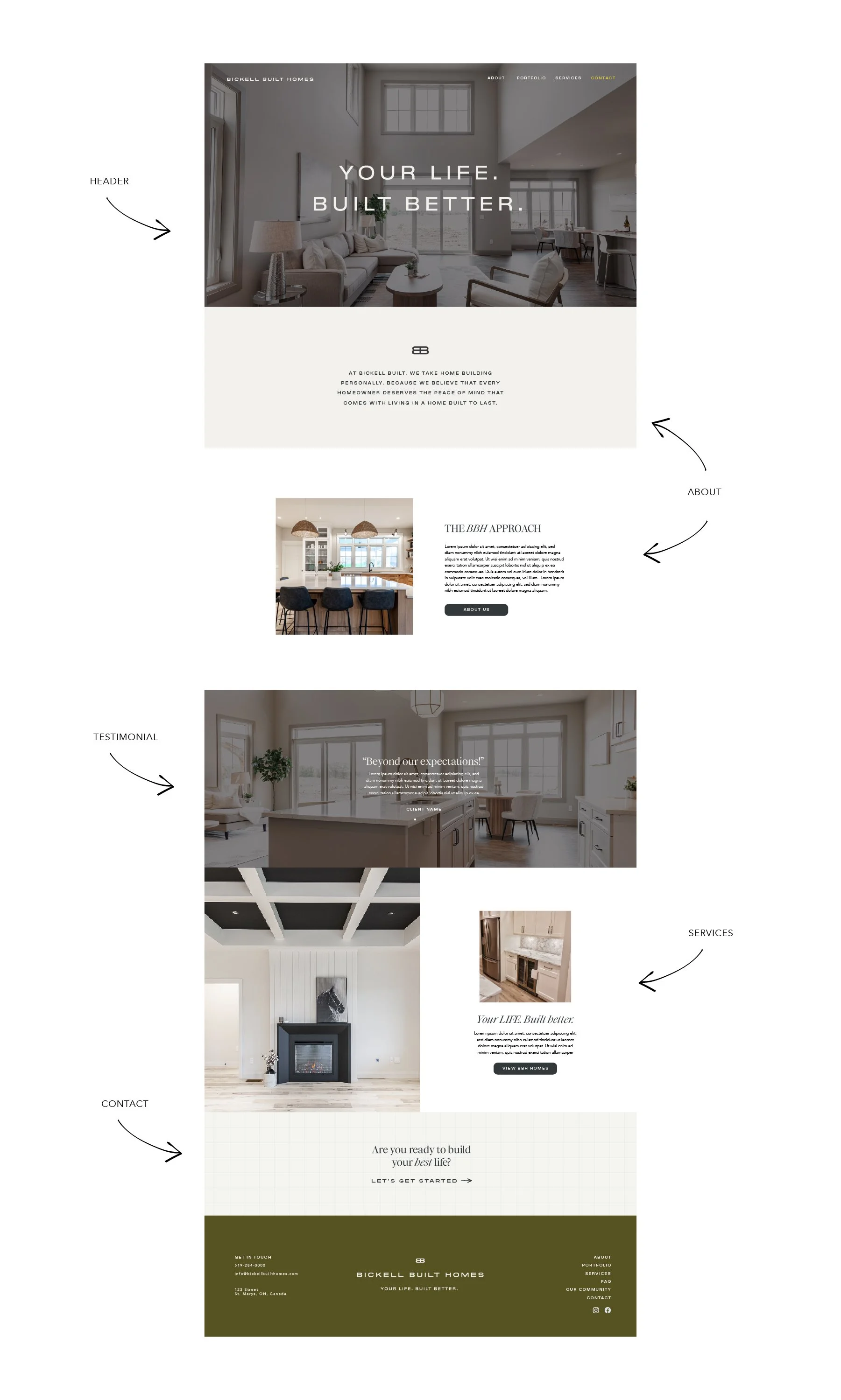
Here's a Sample Homepage Flow
Let's say you run a service-based business. It's going to be really important for your dreamy client to learn more about you and see your credentials to inspire conversion.
With that in mind, a possible flow for your website homepage could be:
Header: Intro the brand / what you do at a high level.
About: Include a blurb about yourself to capture your expertise, then invite people to click to learn more about your background.
Testimonial: Add a section with client testimonials that credential you and your work.
Services: Now that you've given folks a reason to trust you, introduce the services and solutions you offer at a high level, with the option to click to learn more on your actual service page(s). If you run a product-based business, this still applies, but you might link to a "shop" page or individual product page.
Contact Form: Maybe somebody is already sold by this point, or they have some questions. Give them a direct line to your contact page so they can start the conversion process.
Other sections to consider: Do you have serious goals around growing your newsletter community so you can regularly promote products or offerings? It might make sense to include a newsletter signup higher up. Or, maybe you need to push people to a schedule or booking tool so they can sign up for your classes, or events. Bump that up and integrate your scheduler so it's a seamless experience.
I could go on and on here, but the point is to ground yourself in your business goals then build from that space. The flow, messaging, and CTAs you use will depend on heavily on that, but generally this approach satisfies most of the main categories someone would need to interact with in order to make a decision. That decision might be to covert right away, that decision might be to learn more on independent pages. Either way, make sure you have plenty of CTAs and opportunities to link between pages of your site so people never run into a dead end.
Good design is built on great strategy
Building a better website requires a fusion of beautiful design with a user-friendly flow that's both functional AND powerful enough to engage and convert.
Sure, that template you picked out may be pretty, but does it support your messaging hierarchy and business goals?
Have your strategic design vision in place before you commit to a specific design so that you can shop around for the best-fit option. And there are plenty of great options out there!
If you're feeling super overwhelmed by this, you aren't alone.
First and foremost, I want you to know that YOU CAN do this on your own. You already have the tools and the information, you just need a little bit of time, patience, and some good-old-fashioned encouragement from someone who has been there and done it (that's me, and I'm sure as heck cheering you on)!
If you're short on time and patience, I get that too. It's actually how a lot of folks end up at my agency door. We created a semi-custom website offering that's kind of the perfect middle ground between DIY-ing your own site and a full-out custom web build. If you feel like that might be more your speed, send me a note over there and we'll talk!
Ready to read more?