Color Palettes for the Innocent Brand Archetype
Softness and purity are some of the top associations with the word Innocent. Because of this, using muted and gentle colors for your Innocent brand will help tap into the power of your brand archetype.
Your clients are drawn to you because of the minimalistic style you present, so there is no need to try and be something you are not! Below are three color palette ideas that relate to different key characteristics of the Innocent brand archetype: gentle and minimal, traditional and authentic, and nostalgic and optimistic.
Gentle & Minimal
As we mentioned above, the Innocent’s minimalism is one of their strengths. They attract people who appreciate simplicity above boldness and feel that the simple solution is the right path to take.
The color white is seen as pure and clean, so don’t be afraid to use it as one of your main brand colors! A soft periwinkle blue and an unsaturated yellow quietly bring in some color and life, while a barely pink and soft peach bring some softness and femininity. Lastly, a dusty navy adds a sense of grounding and balance out this combination.
Traditional & Authentic:
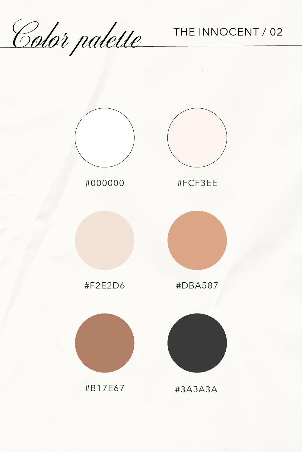
Authenticity is extremely important to this archetype and its clients. They trust your brand because they know you will do the right thing with the right motives!
This second palette uses a traditional combination of shades that still feel soft and innocent. White is our first color again, but this time we include an almost black shade to create some contrast. Two shades of mauvey-tan are paired with two shades of pinky-creams to make this palette feel nearly monochromatic while providing contrast.
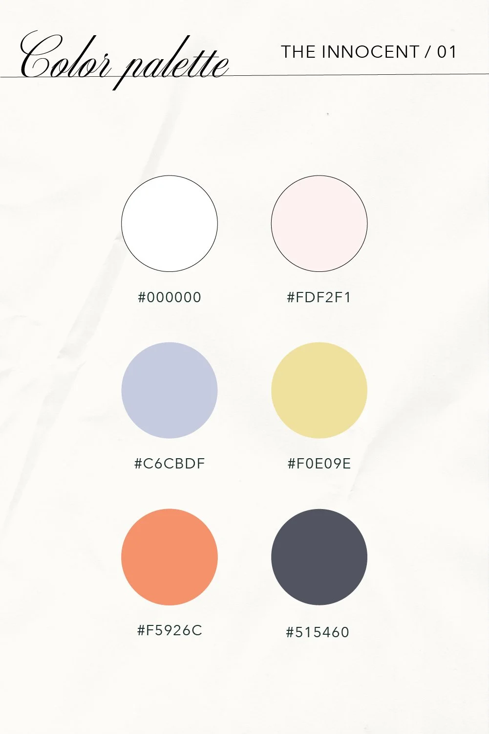
Nostalgic & Optimistic:
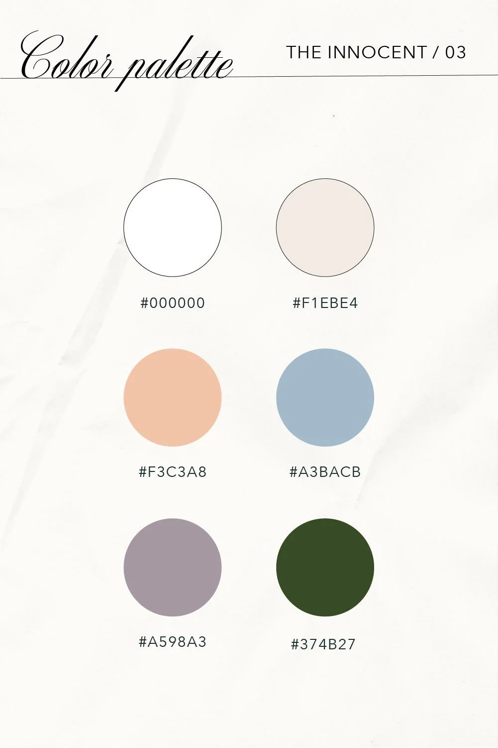
Staying minimalistic does not mean you have to shy away from color completely! This last palette uses slightly unsaturated colors to play into the child-like optimism that this brand archetype possesses.
An off-white and dusty blue act as neutral shades while four additional colors can be used in moderation to add touches of happiness. Peach pairs with the blue nicely, and a dusty grape purple create a joyous and almost retro combination. For a deeper shade that provides strong contrast (great for type), a deep green is a bit softer than the darker black. And, using a bright white again is that perfect innocent option that can’t go wrong.
Colors are used in almost every aspect of brand identity, so choosing a combination that resonates with your dreamy audience will help set you up for success. Clean and bright whites, dulled blues and greens, and warm tans come together to emphasize the simple and honest nature of the Innocent brand archetype that is oh-so special!
Are you an Innocent Brand Archetype? Read about font pairings for the Innocent, curate a mood board from some of our favorite Innocent Inspiration images on Pinterest, or dive deeper into more information about Innocents and their key traits.