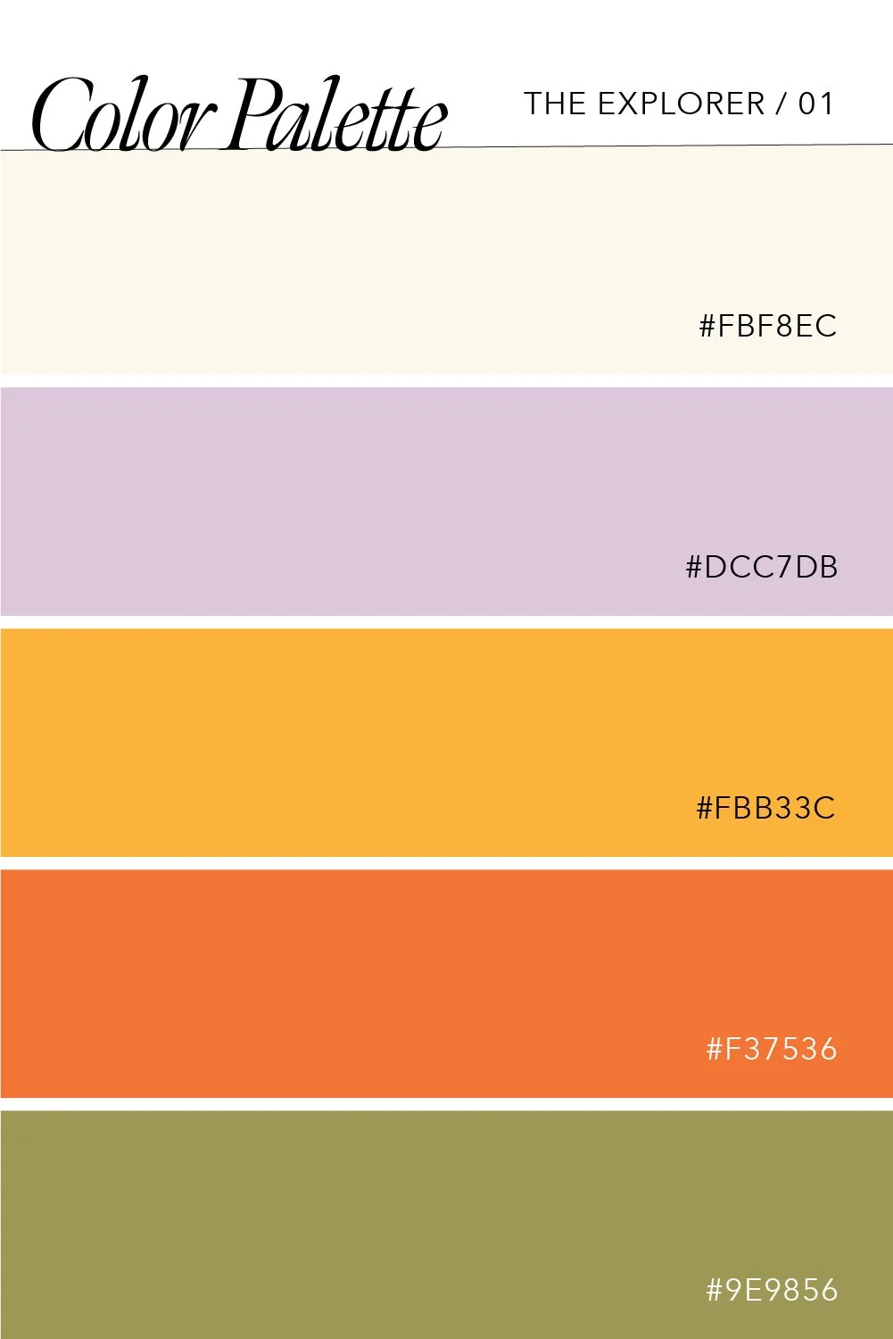
Color Palettes for the Caregiver Brand Archetype
The Caregiver is welcoming, warm, and comforting, so it is only natural that the color palettes for this brand archetype are the same.
By choosing one of the palettes below you can activate your brand archetype while playing into some of the different key characteristics of the Caregiver: nurturing and sentimental, generous and sentimental, and empathetic and compassionate.
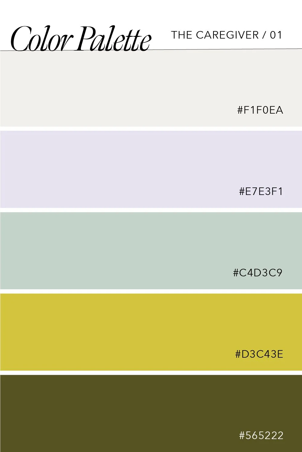
Nurturing & Sentimental:
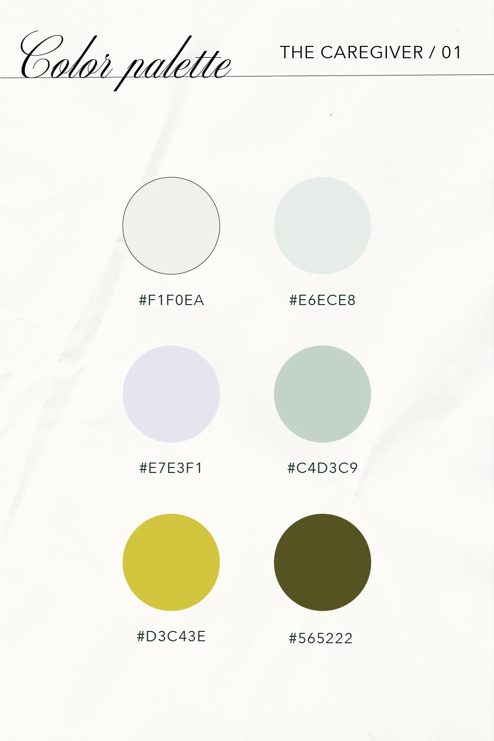
The Caregiver's primary goal is to help and serve others, and this is often done by nurturing their audience and their goals. These brands use design elements, such as color, to show their sentiment and create a comforting space.
This palette uses soft and muted colors to invite the audience in. A light salmon contrasts with a periwinkle blue, and the addition of a bright clean white finalizes the lighter half of this palette. A faded army green, a dark mustard gold, and a deep emerald ground the lighter colors while retaining the Caregivers nurturing and sentimental qualities. This is why huge, successful companies pay hundreds of thousands of dollars to branding agencies to pick the perfect colors for their brand.
Generous & Supportive:
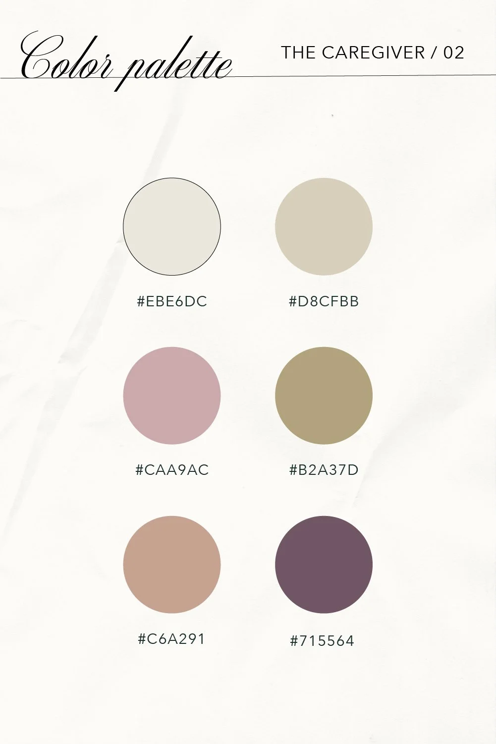
A lot of caregiver brands we see use colors found in nature to help bring relaxation and realness to its branding. Natural colors also help convey this brand archetype's generosity and strong support. This palette uses both bright and darker colors inspired by nature. A golden burnt orange and deep autumnal maroon contrast a rosy pink and lemon yellow. Lastly, a deep teal and crisp cream are added to round out this palette. These colors are a great choice to show a bit more maturity while remaining fun and interesting in your Caregiver's brand.
Empathetic & Compassionate:
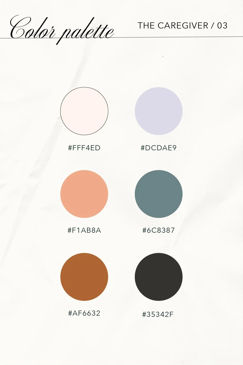
If you are looking for a bit darker palette, this last one is for you! Using many of the same tones as our earlier palettes but darkened down, it resonates with this brand archetype's empathetic and compassionate natures. The light pink and green help bring out your audience's emotions, while the dark maroon blue and black create a sense of trust. This sense of trust is what will help you create a strong connection with your dreamy clients. It uses colors found in nature to appear honest and real and is a great choice for the Caregiver brand archetype.
Using color, especially regarding emotion and feeling, is one of the best ways to communicate with your audience. Comforting and reassuring colors, warm creams and whites, and supportive darker shades come together to create the perfect palettes for the Caregiver. Be conscious of your presentation to the world and lead with the gentle connection you do best!
Are you a Caregiver Brand Archetype? Read about font pairings for the Caregiver, curate a mood board from some of our favorite Caregiver Inspiration images on Pinterest, or dive deeper into more information about the Caregiver and their key traits.