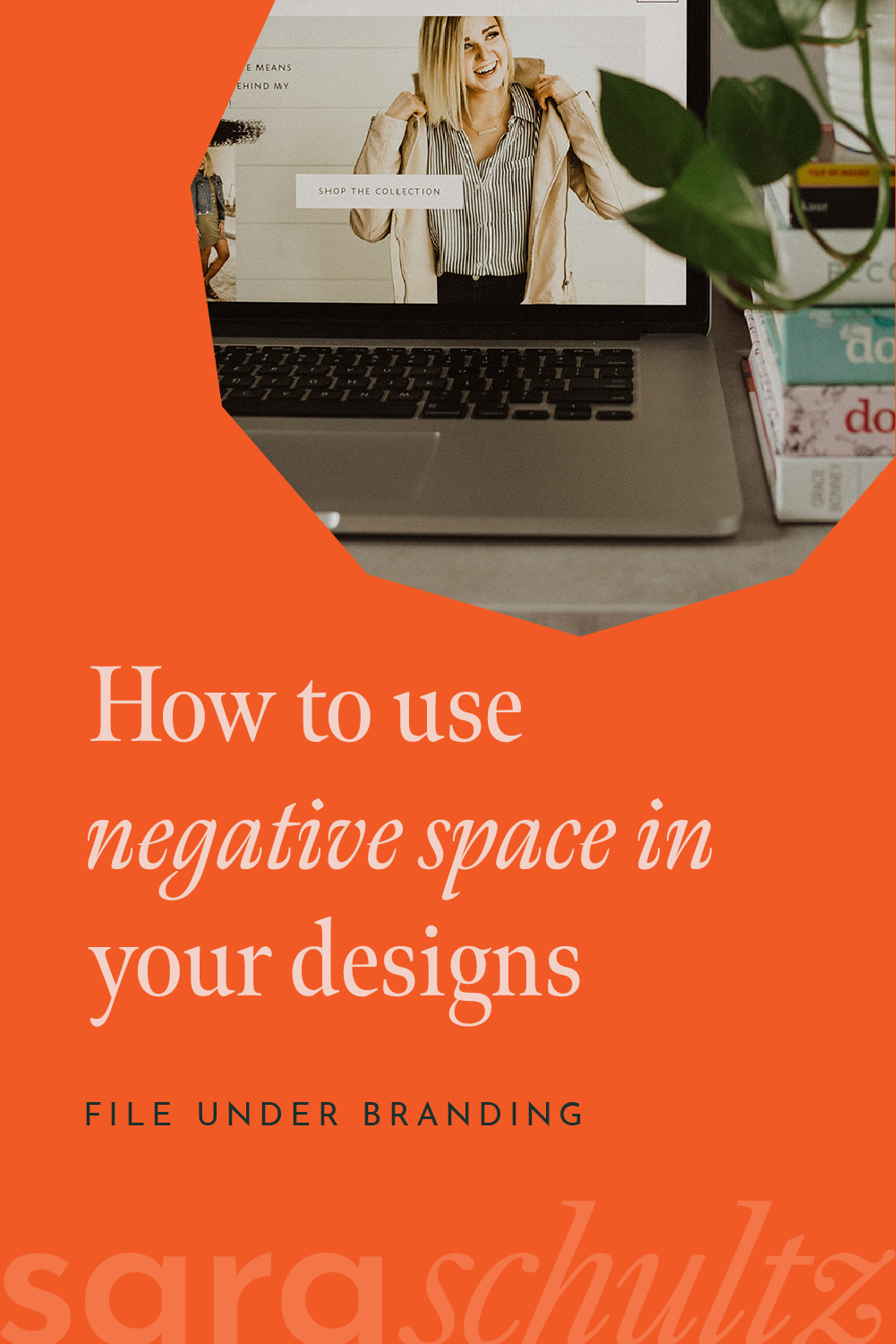
How to Use Negative Space in Your Designs

NEGATIVE SPACE IS YOUR FRIEND! IN FACT, USING NEGATIVE SPACE IS JUST AS IMPORTANT AS USING YOUR BRAND COLORS, FONTS AND OTHER ASSETS.
Do you do it all? Wear many hats? Enjoy the process of learning every little bit of your business and want your hand in all aspects of your brand?
I get that!
However misguided it may have been, I’ve Youtubed my fair share of home improvement projects. And while it might have come out cleaner, faster, and more visually appealing to hire a professional to install my flooring, I did it myself anyway.
So, I can totally appreciate your desire to DIY your branding and marketing. I get it. But before you do please, PLEASE, for the love of all that is holy, listen to this one piece of advice:
Respect the negative space.
You may be wondering, “Hey Sara! What is negative space?” Good question! Before we dive into actually using negative space in graphic design, let’s talk more about what negative space actually is.
What is Negative Space in Design?
Negative space, or white space as it is sometimes called, doesn’t actually have to be white. It’s simply the space between, around, and even inside of the graphic elements in your designs.
Using negative space is frequently misunderstood by non-designers; while some may see it as wasted space, it’s not. Your design needs room to breathe!
“White space” does not mean boring… it is thoughtful. Deliberately planned, well organized, and strategic negative space is crucial to good design.
Look at the product label above: We intentionally designed this label with room to breathe. Overcrowding would have diluted the message we intended.
Negative space isn’t blank. Good designers intentionally work on using negative space in numerous ways: as a tool that can provide balance and harmony, to direct the viewers’ eye to important visual elements in the work, and/or to keep your design clean, uncluttered, and legible.
When designing, I have to decide what makes the cut. What images do I include? What text? How many elements are crucial to the design? This is where you can let your creativity and branding personality shine! But don’t overdo it. Remember the rule…
Respect the negative space!
Think about the space between
T H E S E L E T T E R S.
These lines of text.
These words.
All of this was chosen thoughtfully to make the impact we planned for.

How to Use Negative Space in Design
Unfortunately, many do-it-yourself types haven’t listened to my “Using Negative Space TedTalk” (not their fault… I don’t know why TedTalk hasn’t called to book me yet!). They throw in everything they love and the designs are left cramped and cluttered. Sigh.
Let me help you take your DIYing to the next level. Grounded in the notion that “negative space is not wasted space,” here are some things to keep in mind when you are creating anything from logos and submarks to social media graphics:
Look at your design. Evaluate each individual element and ask yourself: “Do I need this? Does this add value?”
If the answer is YES, then you can keep it! If the answer is NO, get it the hell out of there!
You aren’t done yet. Now that you are left with only the necessary elements, we need to evaluate the sizing, spacing and distance of the elements (distance from each other, AND distance from the edges of the artboard!). Can you add space by resizing the text, or spreading out the letters in your copy? Can you rearrange the elements to let them breathe more comfortably? Can you delete unnecessary words or borders? Can you use a design grid to create a visually pleasing layout?*
*Hint hint, my favorite DIY design tools, SqaureSpace and FloDesk, use design grids to help with layouts and designs.
Why Using Negative Space Is So Important
Design is about conveying a message. What is the message you are trying to express? Pick the ONE THING that is most important and get rid of the clutter that is keeping your message from shining.
When you focus on using negative space strategically, you can ensure that your important message is the star of the show and more easily understood by your dreamy clients. Giving your logos, brand fonts and other branding design files room to breathe ensures that your brand personality comes through.
Practice will help, and if you need EXTRA help... you know where to find me! :) Our branding design packages include not only all the branding assets you need, but also branding style guidelines so you can get clear on how to use these assets - and use them with negative space - for the biggest impact.
Contact Sara Schultz Co to get started today!