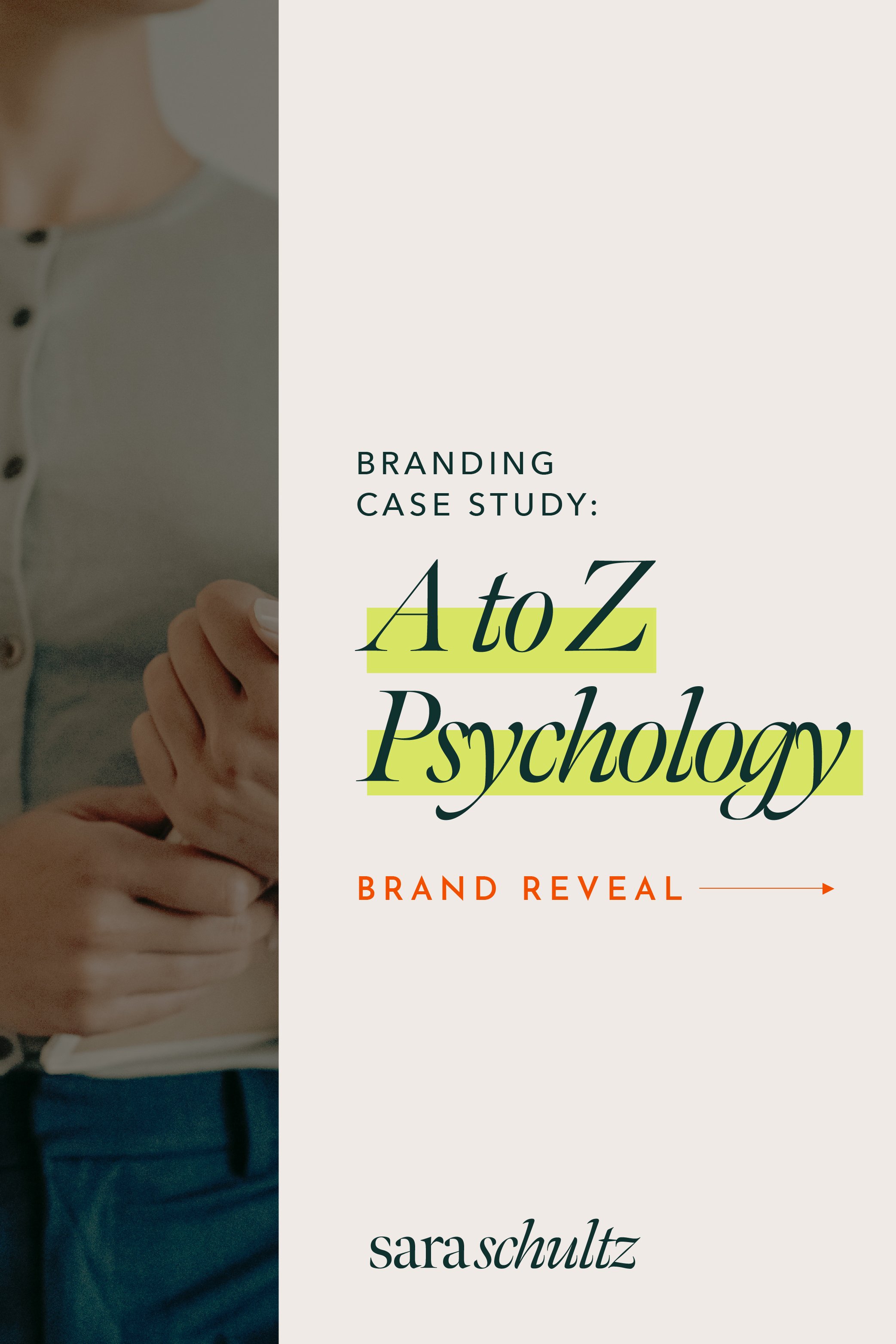
Brand Identity Case Study: A to Z Psychology
In this case study, showcasing Dr. Ashlee Zito’s strong, badass personality through a punchy brand identity was our key branding goal.
I’ve known Ashlee since high school, but anyone can quickly tell she is an extremely driven individual. She is bold, strong, and has a no-bullshit personality. Ashlee’s work can be heavy and is highly serious, so we wanted to create a brand that contained softness, structure, and professionalism while still showcasing her personality.
THE WORK:
Branding
Web Design

Brand Identity Case Study Part 1: Understanding the Brand
A to Z Psychology provides comprehensive forensic and clinical assessment services. Dr. Zito’s passion is helping others identify and navigate difficult situations so that they can live happy, fulfilling lives. A to Z Psychology offers 2 different types of services. The forensic branch of the company focuses on evaluations for adults in the criminal justice system. It also includes expert witness testimony and consultation. In this segment of the practice, Dr. Zito is typically working with lawyers and working closely with legal teams to deliver evaluations.
The second branch of Dr. Zito’s practice focuses on clinical assessment services. In her clinical space, she works with children, adolescents, and adults. These evaluations can help identify things that may be impairing the individuals learning abilities or their day to day life. It was very important to us when completing this brand identity that both areas of A to Z Psychology are cohesively conveyed throughout.

“ I help people achieve their full potential.”
Brand Identity Case Study Part 2: The Work
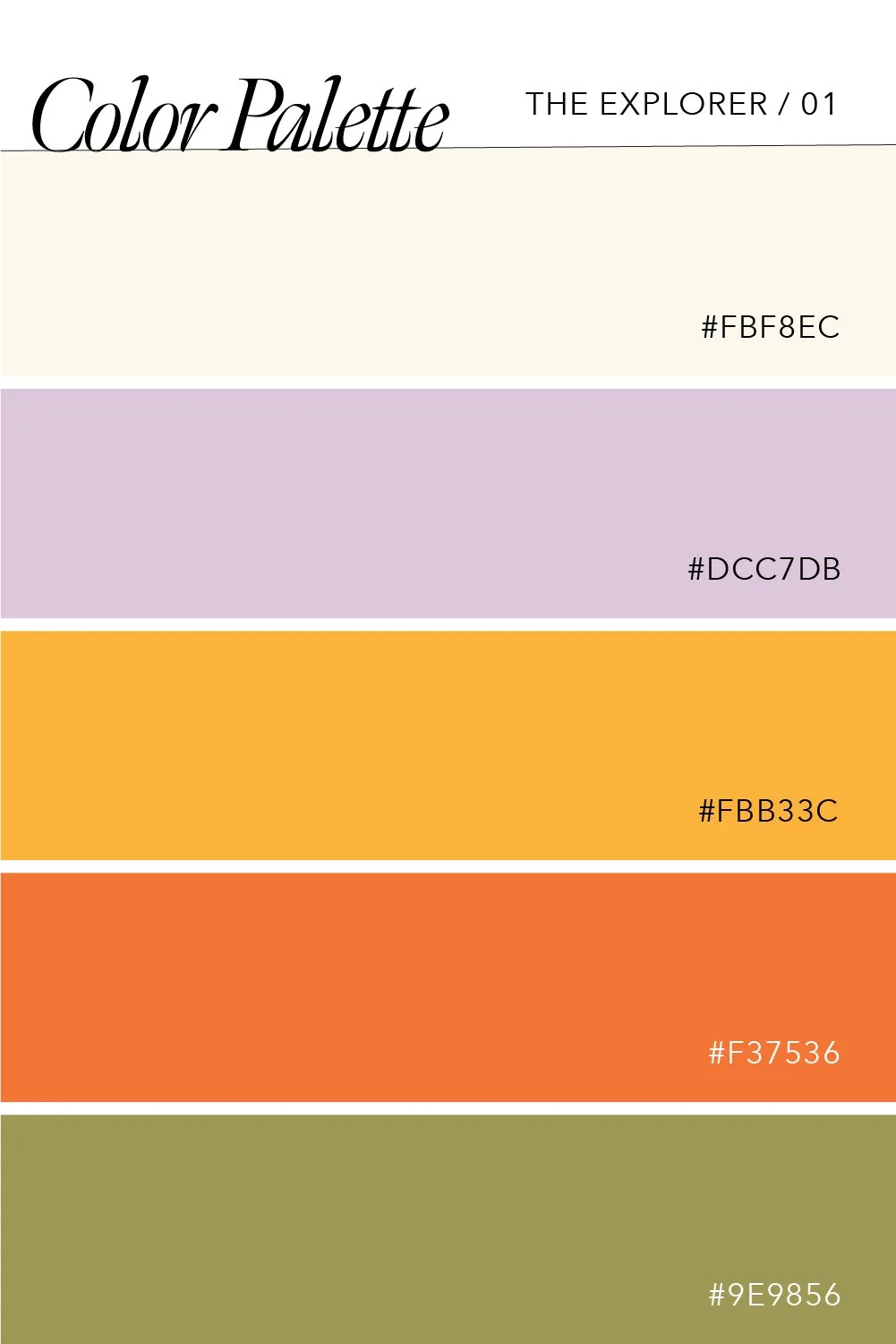
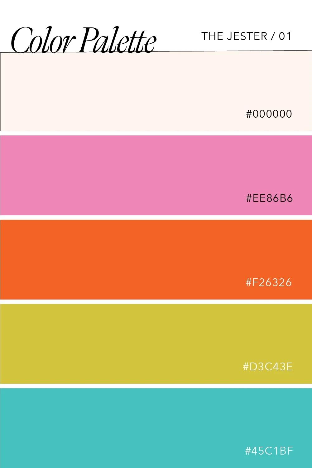
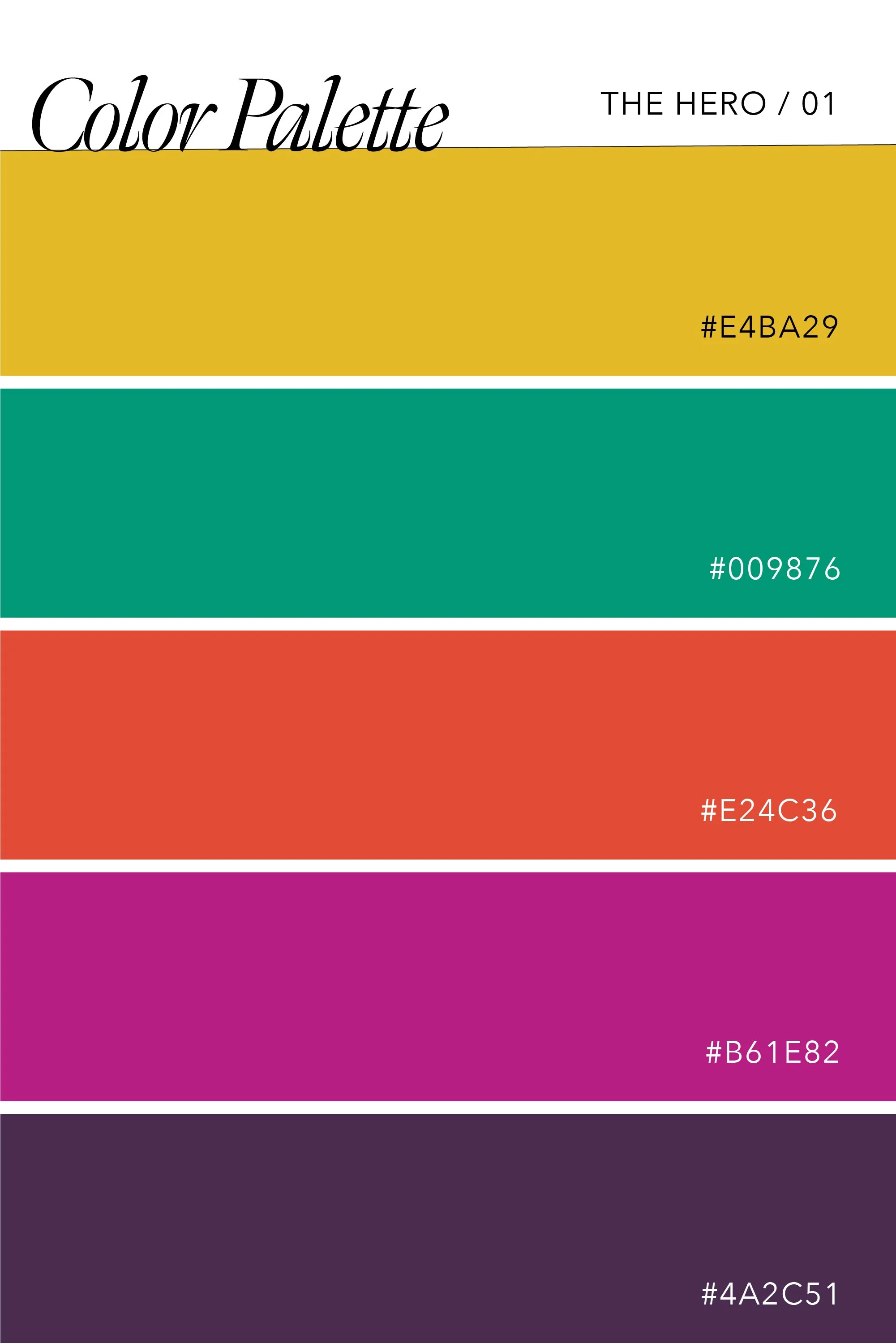
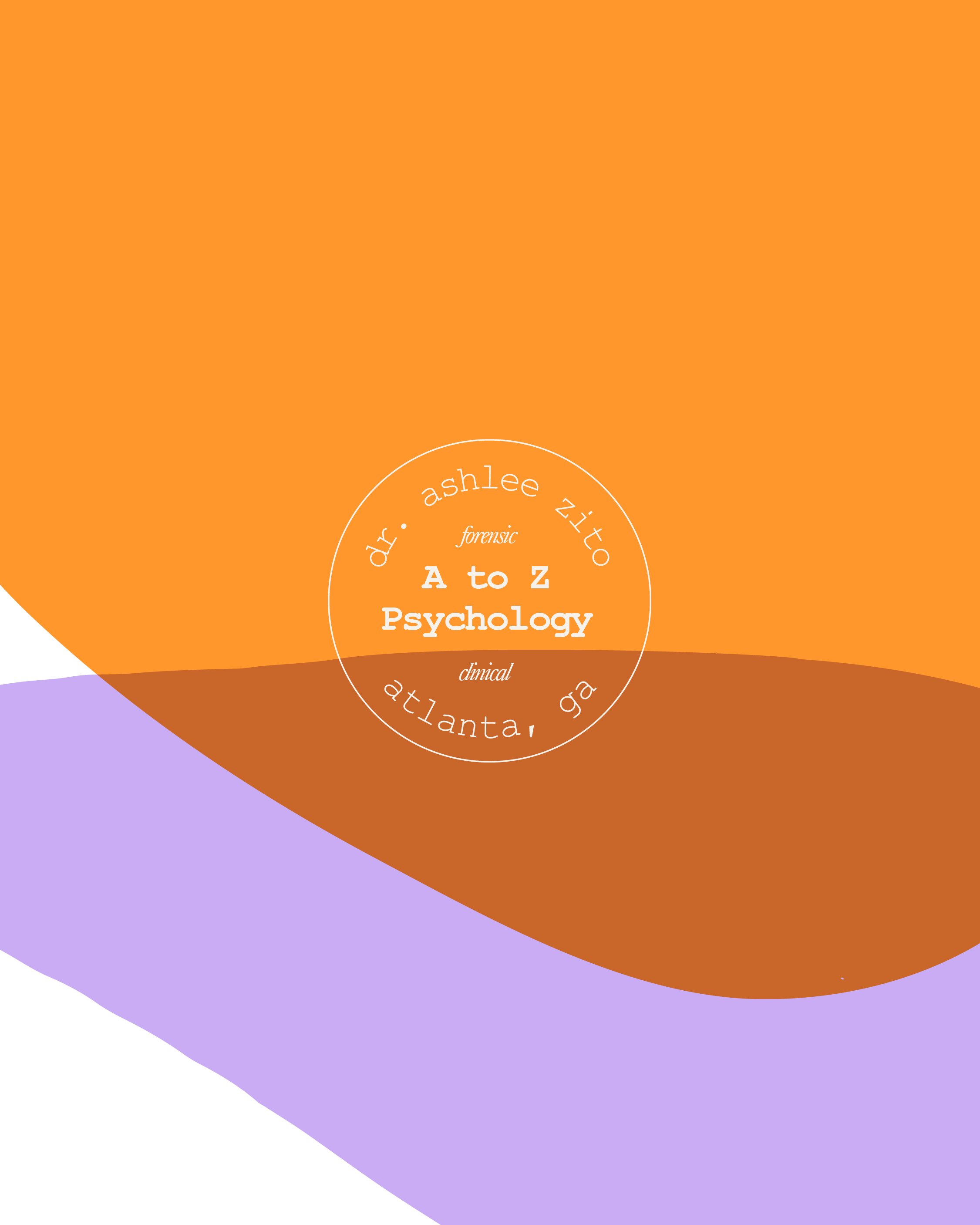
As we began to create this brand identity, we wanted to make sure that Ashlee’s personality came through. Her work caters to two different demographics; it was important to us that we created space for both of these areas. We utilized a fun color palette with bright, contrasting shades of purple and orange. These colors make the brand identity pop and play towards the clinical branch of her business. We balanced these vibrant colors out with neutral, creamy tones. These neutrals are great for her to lean into for her forensic work while the bolder, punchier colors work well in the clinical setting and make things feel approachable and friendly.
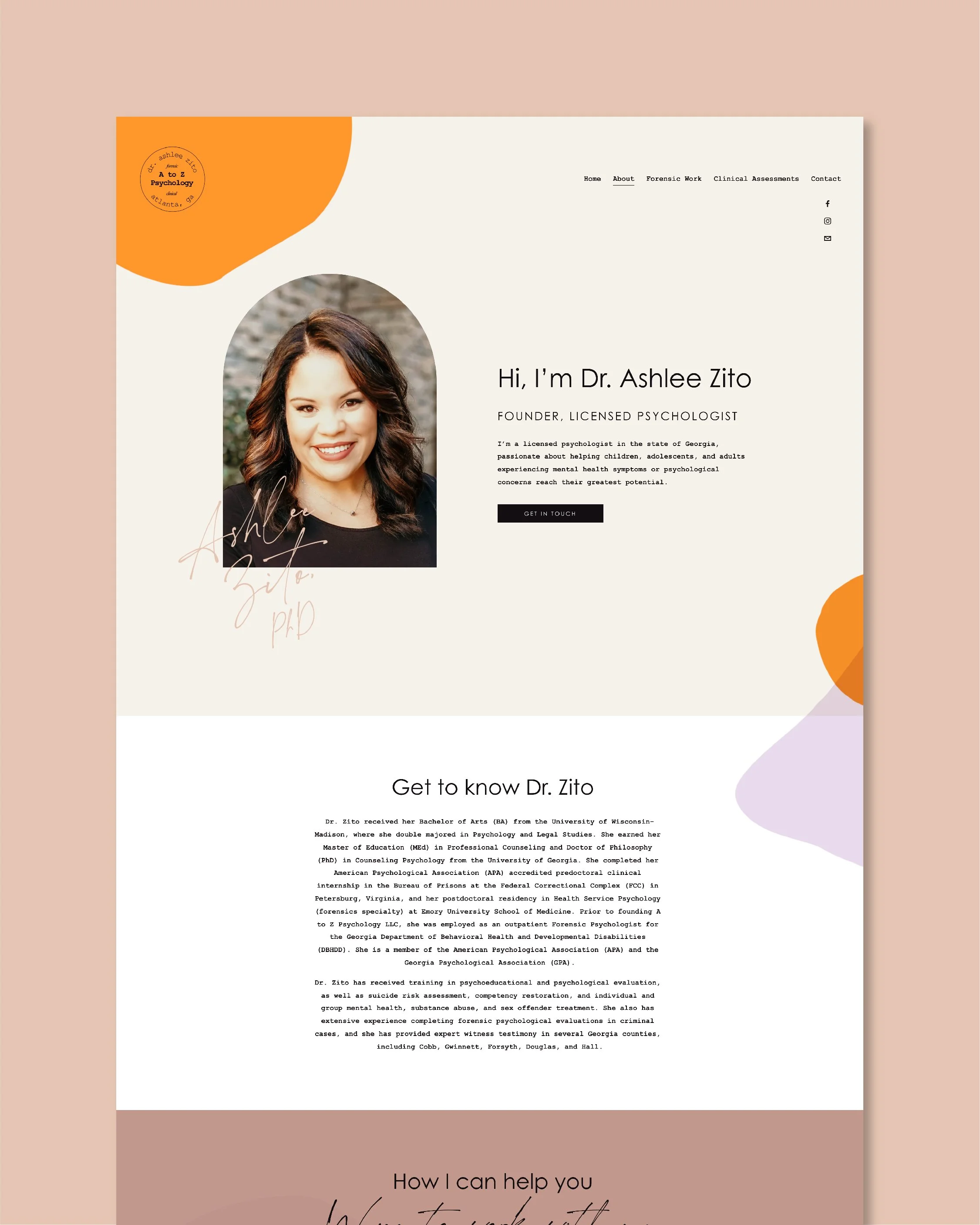
For the brand assets, we wanted these to feel a bit formal. For both the logo and the typography, it feels very much like a seal that would go on official documents. The elements of the brand identity are structured and almost architectural, something we thought served the brand well. The typography feels like something from a classic old-fashioned typewriter, recognizable and comforting while still conveying style. We balanced this out with a San Serif for a nice neutrality. And then every so often we included a fun script font to showcase that personal touch and create a connection point between her and her clients.

We are so excited for Dr. Ashlee Zito as she grows her private practice. Her new brand captures her bold, strong personality. The two branches of her practice are well identified and the style elements capture her professionalism.
Do you have a branding project you need help with? The next branding case study could be yours! We offer high-quality branding and web design services for female entrepreneurs who are ready to level up their businesses and attract more of their dreamy clients. Click here to learn more!